Visual Syllabus
Images in a syllabus can quickly convey information and deepen student understanding. Several studies suggest that sighted students retain information better with a visual syllabus than with plain text (Yarosh, 2021; Kaur, 2021; Mocek, 2017; Yerian, 2009). In one study, sighted students praised visual design, saying:
- “I can visualize the information much better. I have stronger memories of our course syllabus than any other.”
- It “made the course seem less intimidating.”
- And the succinct, “Dope syllabus” (Nusbaum et al., 2021).
However, not all research finds a direct impact on retention (Crispi & Stivers, 2015; Nusbaum et al., 2021; Overman & Little, 2020). Still, these studies report other benefits, such as students rating the professor as “kinder, more creative, and more approachable” (Nusbaum et al.). So even beyond information retention, visual syllabi can shape students’ emotional and relational responses to a course.
In the examples below, images are used to encourage excitement, build connections between the instructor and students, and emphasize key content. There are many options for adding images to your syllabus:
- Illustrate core concepts alongside the course description.
- Feature photos of key authors or required texts.
- Show grade distribution with a pie chart.
- Display logos for class technology like Canvas, Blackboard, or Google Drive.
- Generate word clouds of essential terms.
The following before and after images illustrate one instructor’s move from a traditional text-based syllabus to a more image-driven syllabus in the early 2010s.
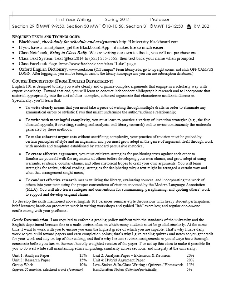 Before: Text-Based Syllabus |
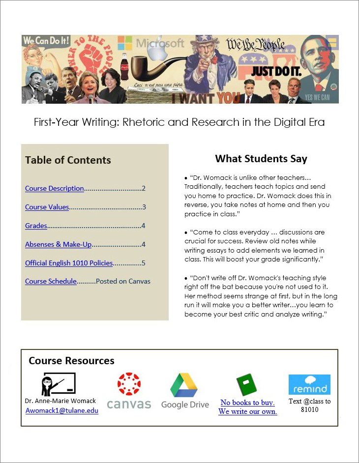 After: Image-Based Syllabus |
The syllabus on the left shows dense text and small margins. It contains the course information, required texts, course description, and grade distribution. There are bulleted lists, but the text covers almost every inch of the page.
In the revised version, information is organized in clear sections. At the top, a banner displays a visually striking collage that previews the course’s focus on rhetoric in contemporary culture. It combines famous political figures, including Barack Obama and Hillary Clinton; iconic American slogans from “Power to the People” to “Just Do It;” symbols from Uncle Sam to the Microsoft logo; and political pundits such as Glenn Beck and Rachel Maddow. This image was used to generate discussion during the first week of class. The course title is First-Year Writing: Rhetoric and Research in the Digital Era.
Below the banner, a table of contents offers hyperlinks to the syllabus components, including course description, grades, and official policies. In another block, three student quotes about the course provide a quick idea of the class structure.
At the bottom, hyperlinked images show essential course resources: a teacher icon with the instructor’s name and email, a Canvas icon, a Google Drive icon, a notebook icon that takes students to a prompt to create their own textbook, and the Remind logo for a class text message system. The revised version strives to provide flexibility with redundancy across modes: images for visual learners, alt text for screen reader users, and digestible sections for learners with reading disabilities.
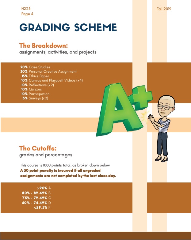
Syllabus images can also help build community in the course. Nursing Professor Nico Osier adds their bitmoji throughout the syllabus, a playful reminder of the real person behind the document. This page features Osier, a light-skinned person with short hair and glasses, clapping their hands for an A+, accompanied by an explanation of how students’ grades are calculated.
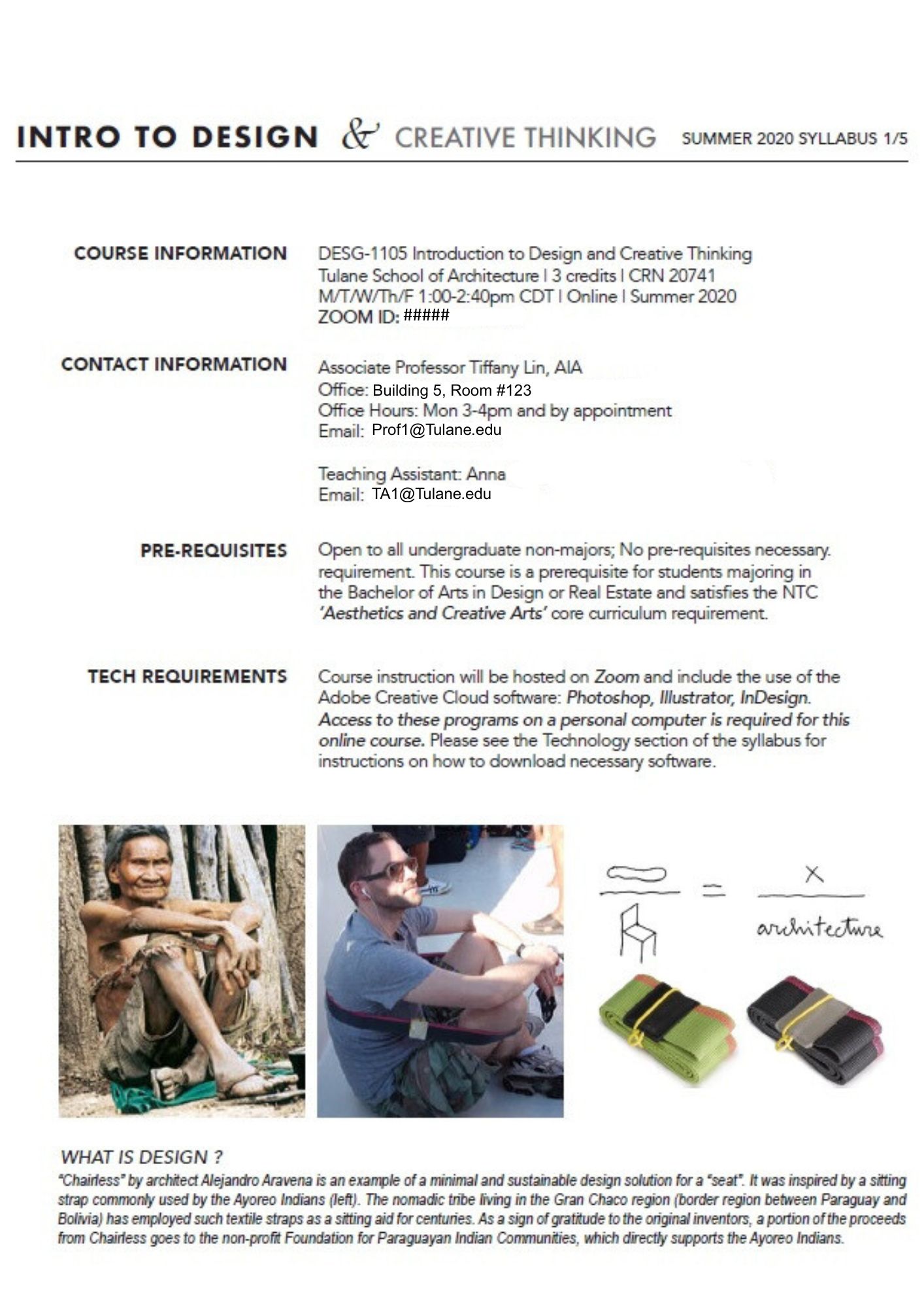
Images can also showcase the inclusive work being done in a course. In the syllabus for Intro to Design & Creative Thinking, Professor Tiffany Lin includes images of people sitting on the floor cross-legged with a strap around their legs as support. She notes that the strap was developed by the Ayoreo Indians and then mass-produced by a Chilean architect who pays the Paraguayan Indian Communities for every purchase. The example shows how Indigenous people turned a simple object, like a strap, into architecture. These images emphasize that her class covers inclusion when talking about design.
Taken together, these syllabus examples show how images can function as rhetorical tools that support learning, accessibility, and community building.
Free Image Websites
When incorporating images into course materials, college instructors have to navigate legal questions of copyright and fair use. While these issues are beyond the scope of this site, resources are available at Copyright & Fair Use for Faculty.
Some instructors also include images of students engaging in class activities. In these cases, colleagues obtain written consent with tools like a Google form or an electronic contract. To ensure that consent is given freely, it’s important to clarify that participation is entirely voluntary and will not affect students’ grades.
Several websites offer images that are typically free for educational use:
Some image sites also offer inclusive stock photos, addressing the problem that many mainstream and AI-generated images overwhelmingly feature white men and other dominant identities.
All Images Need Descriptions or Alt Text
Images can be powerful educational tools, but they often exclude blind and low vision users, as well as anyone who cannot easily interpret the visual content. To make images accessible to all readers, writers should either describe images directly in the surrounding text (as shown with the earlier syllabus examples) or embed image description into the digital document using alternative text, commonly known as alt text.
Bryan Gould of the National Center for Accessible Media recommends three questions to consider when writing alt text:
- Why is the image there?
- Who is the intended audience?
- If there is no description, what will the readers miss?
This third question, as Gould points out, does not suggest that alt text should capture every visual detail. Instead, it should focus on the most essential concepts–those that carry weight within the rhetorical and educational context.
Image Description Responds to the Rhetorical Situation
What matters most in a visual can shift depending on the discipline and assignment, so writers should always consider the rhetorical context when writing image description. For example, alt text for a graduate engineering course will look quite different from alt text in a first-year writing course.
STEM image description guidelines typically prioritize brevity and emphasize essential data over extraneous details. For example, alt text for a graph might read: “Line graph showing atmospheric pressure remaining steady during the spring, followed by a sharp increase in June and gradual decrease in late August.” Then all data points would be made available in an appendix or website. Engineers need these precise details to be accessible so they can use and evaluate data.
In contrast, students in English or cultural studies often interpret cultural images or art, which calls for richer descriptions to support students. In More Than Meets the Eye: What Blindness Brings to Art, Georgina Kleege describes a photograph of Carmen Papalia’s performance art entitled “Mobility Device”:
He abandoned his white cane and substituted a high school marching band. The band spontaneously improvises a vocabulary of sounds to alert him to obstacles and help guide him from place to place. Together, they navigate city streets, enter sandwich shops, board buses, and so forth. Here, the artist appears in the midst of his band, wearing the standard costume for his performances–a tailored vest and a fedora. His arms are at his sides and his head is lowered slightly as he attends to the sounds around him. The band, in their vaguely military uniforms, surround him. Sunlight glints off the bells of the tubas. The band director, his arms raised, conducts from the left side. Behind them, passers-by in ordinary dress look on and follow along as they move across the street.
Kleege’s description layers sensory and contextual details, modeling the kind of depth that supports students’ visual analysis. The same goals animate the Alt Text as Poetry project, where Bojana Coklyat and Finnegan Shannon reframe alt text not as a perfunctory requirement but as a creative, expressive form.
Overall, these different approaches demonstrate that image description is a rhetorical decision, one that must respond to discipline, audience, purpose, and learning goals rather than follow a single formula.
What Makes Good Alt Text?
Just as there is no single way to create image description, there is also no single way to create alt text. Widely-cited guidelines are a good starting point, but there are no strict requirements:
- Avoid stating “image of” or “picture of.” Screen readers already indicate the presence of an image.
- Move from general overview to specific details, allowing readers to decide how deeply to engage.
- Keep descriptions as concise as the rhetorical situation allows. Many sources recommend between 5-15 words, but this number is not a strict rule. Many alt text examples use over 20 words to make room for crucial historical details, for instance.
- Ask someone who has not seen the image to review alt text to check for clarity and completeness.
Here’s one example of alt text that follows these principles but is intentionally longer. In such cases, it’s especially important that the first line summarizes the entire image. That way, blind and low vision readers can decide whether to explore further or move on–just as sighted readers choose when to stop looking at an image.
Example:
Rosie the Riveter, a World War II icon of women’s labor, says “We Can Do It!” She is a white woman wearing a blue work uniform, sleeves rolled up as she flexes her arm. A red polka-dot bandana holds back her brown hair.
This description briefly combines historical context with visual detail, moving from more general ideas to more specific.
Describing People’s Identities
In the above description of Rosie the Riveter, notice that her skin color is noted as white. In many classes, such as a history class, this identity marker matters because women’s labor was framed differently for women of different ethnicities.
A common problem in image description arises when writers either omit skin tone or only describe it for People of Color. This practice reinforces the false assumption that whiteness is the norm and default (Adegbite). Disability rights lawyer and activist Haben Girma elaborates on this problem. As a Black woman, she is used to other blind people telling her they assumed she is white. She attributes this false assumption to inadequate descriptions.
Describing race or skin tone, however, depends on the rhetorical situation. For instance, here’s another example of alt text, this time from Time Magazine.

President Barack Obama walks across the tarmac as he prepares to board Air Force One before his departure from Andrews Air Force Base, Md., Oct. 9, 2015.
The description follows a journalistic style, prioritizing the who, what, when, where, and why. It assumes that President Obama’s race is common knowledge and therefore omits that detail, keeping the focus on his immediate action.
When describing people you don’t know, careful judgment is needed to provide descriptive detail without making assumptions about a race, gender, or ethnicity. Many experts recommend focusing on observable characteristics—such as skin tone, hair, or clothing—rather than speculating about someone’s identity.
Anne-Marie Womack, who researches inclusive teaching practices, recommends using images of individuals who have publicly described their identities or who can be contacted for self-description, ensuring that people retain agency over how they are represented. At the same time, she acknowledges that cultural context shapes how images are interpreted. For example, she cautions against relying on stock photos that predominantly feature white men. Even though the individuals are anonymous, the cultural message is unambiguous: such imagery reinforces dominant norms about who belongs in academic spaces.
These decisions—whether describing real people or selecting representative images—require ongoing care, context, and awareness of how visual cues are culturally read. Georgina Kleege reminds us that description is never fully objective (More Than Meets the Eye). She and Scott Wallin argue that all description carries “aesthetic, ideological, political and ethical underpinnings” (Audio Description). Their work invites instructors to teach students to write descriptions that foster critical thinking and visual literacy.
AI Image Description
AI can assist with image description, but like all machine learning tools, it reflects and amplifies the biases embedded in its training data. As a result, disabled people cannot rely on AI alone to ensure meaningful access to visual content. Scholar Sushil Oswal describes digital tools as both a “boon and a bane” for blind users: while they may increase access technically, they are often flawed and limit humans from doing better access work.
Engineering communication specialists Womack and Mary Glavan teach image description to students based on these insights. They emphasize both the communal nature of access work and critical examination of how AI tools shape descriptions.
The evolution of descriptive technologies can highlight why humans are always needed for description. In 2017, we used an alt-text bot to describe several images. Some descriptions were more successful than others. In 2025, we used GenAI technology and different problems emerged.
Example 1:
For example, we used a famous U.S. image reprinted in Wired magazine with the caption: “An American sailor kisses a nurse among the crowd in Times Square celebrating VJ Day, the long-awaited victory over Japan in WWII, on August 14, 1945.”
In 2017, the alt text bot produced: “Couple kissing in grayscale.” It follows the rule of conciseness but misses the necessary cultural history. In 2025, ChatGPT produced:
This is a famous black-and-white photograph taken in New York City’s Times Square on V-J Day (Victory over Japan Day), August 14, 1945.
The image shows a U.S. Navy sailor bending a woman dressed in a white nurse’s uniform backward in an embrace and kiss amid a bustling crowd celebrating the end of World War II. The background is filled with other people—many of them sailors—walking, smiling, and observing the scene. Tall buildings with billboards and advertisements flank the street, contributing to the lively, celebratory atmosphere.
The photograph captures an iconic moment of public jubilation, although it’s worth noting that in later years, the context of the kiss has been discussed more critically regarding consent.
ChatGPT captures the historical context and contemporary critique better, but for some contexts, the description could benefit from some trimming.
Example 2:
In contrast, the 2017 chatbot technology was more successful than 2025 ChatGPT at a different type of image. Even though the following image contains a wealth of extraneous visual detail, the chatbot produced the clarifying description: “Knowledge illustration with silhouette of a person.” This description is brief and literal.
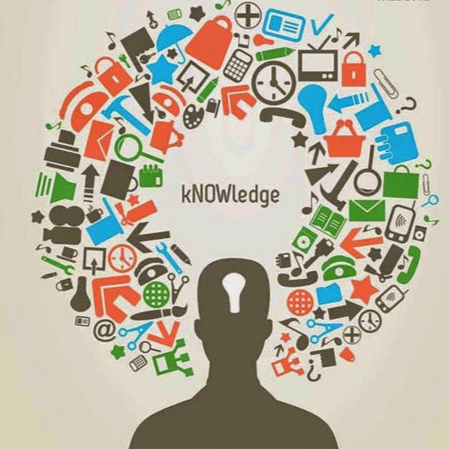
Knowledge illustration with silhouette of person
When we asked ChatGPT to describe the same image in 2025, it generated the following:
This image is a stylized conceptual illustration of knowledge. It features the silhouette of a person in black, with a keyhole shape in the head area, symbolizing the mind as a space for unlocking or accessing knowledge. Surrounding the head is a semicircle or burst of colorful icons representing various domains and tools of learning—such as books, clocks, computers, gears, pencils, graphs, communication symbols, and medical symbols. These icons are in red, green, blue, and black, conveying a sense of diversity and interdisciplinary learning.
In the center of the burst, above the silhouette’s head, is the word “kNOWledge,” with the letters “NOW” capitalized—emphasizing the urgency or immediacy of learning in the present moment.
Overall, the image metaphorically illustrates how diverse forms of information and symbols come together to fill and shape human understanding.
Both descriptions begin similarly, but they quickly diverge. ChatGPT’s version offers more visual detail and analysis (such as the capitalization of NOW conveying urgency). But at 133 words (vs. 7 words), it is too long and cumbersome for many users and purposes.
As AI tools become more sophisticated, scholars are developing better prompts to guide AI in image description. For example, scholar Kent Matsueda has created a social justice-oriented prompt to support more inclusive image description. Still, access labor must remain a collective, human-led effort. Technology can be useful, but should not be overestimated.
Missing and Null Alternative Text
If alt text is left blank, screen readers will announce the presence of an image but provide no description. This omission excludes blind and low vision readers from the document. Over time, these repeated denials of access can lead to emotional and physical exhaustion. Scholar Annika Konrad calls this “access fatigue,” a term that captures the cumulative toll on disabled people who constantly advocate for accommodations that are ignored, delayed, or denied.
Instructors might assume that a student would simply ask for image description if it were missing. But when access is denied across multiple courses each day, students often become too depleted to keep asking and lose trust that asking will make a difference.
There are cases, though, when images don’t need description, such as purely decorative images. For instance, a flourished line serves no informational purpose. Below, the phrase “Welcome to Introduction to Psychology” is separated from “I look forward to getting to know each of you.” (A description is necessary in the context of this website, but not on the actual syllabus.) In these cases, do not leave alt text blank. Instead, explicitly set alt text to null so that screen readers skip the image entirely.
Flourished line separating two text sections
Tips for using null alt text:
- To create null alt text, type two quotation marks into the alt text box: “”
- Do not use null alt text if the image includes a link because screen-reader users will not be able to navigate to the link.
- If the image is described in a caption, use “refer to caption” in the alt text box instead of null alt text.
These simple practices can reduce the repeated burden of missing image description.
Color Universal Design
Images often introduce color, a format that isn’t readable for everyone. Colorblindness, like all disabilities, varies from person to person. Still, a few basic design moves can help make color more accessible. Scholars Kei Ito and Masataka Okabe offer tips:
- Never convey information through color alone. Instead, use redundancy—combine colors with different line styles, such as solid, dashed, or dotted.
- Create contrast not only in color hue, but in brightness. (For example, white on a dark background is easier to read than red on black, which can appear as all black to many viewers)
- Use a green laser pointer in class because it’s the most visible across different types of colorblindness.
Consider an example of how two contrasting images use color in design.
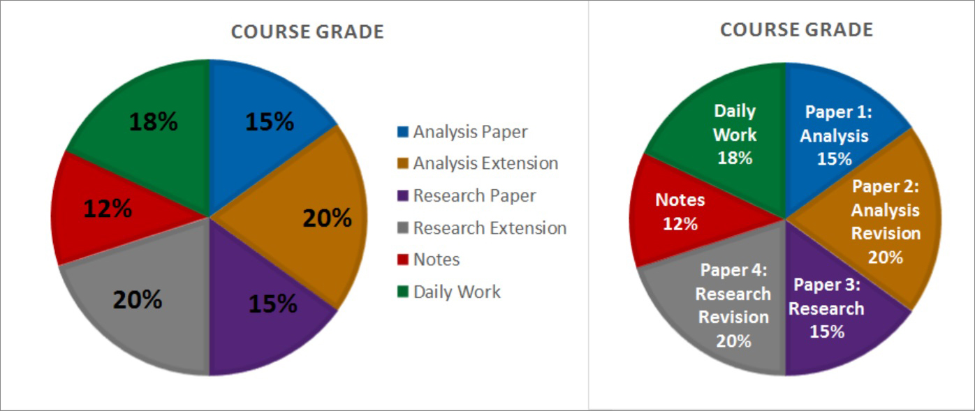
Both pie charts show how assignments are weighted in students’ grades. The first chart uses a separate color-coded key on the side. It also layers black text over dark colors, making it hard to read.
The second chart is stronger. Each slice is labeled directly inside the chart, using white on dark colors for better contrast. It also outlines each section with a darker shade. So, contrast, not simply color, divides the sections. This second pie chart is more accessible in its color usage.
If you’re color-sighted and unsure whether your design is legible, print it in black-and-white. You’ll see right away if your version is easy to read. With this strategy, it becomes clear which of the earlier pie charts is accessible. And it’s not the one that uses a color-coded key and low contrast.
Overall, when visuals are readable in multiple modes, they can create an engaging tone for the course and support student learning.
Text Only Syllabus
Many visual design features—like text boxes or complex layouts—create cool syllabi but also barriers for screen readers. (We used Microsoft Narrator to test accessibility, consulting Microsoft’s Accessibility Guide for Educators and the Complete Guide to Narrator.) But that doesn’t mean we need to avoid images or organizational tools like bullet points altogether. These elements can still be meaningful to screen reader users. It just means we need greater multimodal access, so information is available in more than one way.
One strategy is to offer a text-only version of the syllabus (or any visually rich document). On Womack’s syllabus, she inserts a hyperlink at the top of her syllabus labeled “Text only syllabus.” This version is easier for screen readers to navigate: it uses clear heading structure (with Word styles) and image description appears in the main text instead of being embedded as alt text. Womack likes this method because it allows her, as a sighted professor, to see exactly what a screen reader will read.
Good syllabus design must look appealing and function well for a diverse group of students.