Flexible Multimodal Text
Syllabus text should be accessible through multiple modes–visually, orally, and tactilely, with tools like braille keyboards. This type of multimodal access ensures that students are able to read, hear, or feel content. Digital text can offer this kind of flexibility—it allows students to enlarge font size, adjust contrast or color, or use adaptive technologies like screen readers.
But flexibility is not automatic. Many digital spaces remain inaccessible to blind users, as Sushil Oswal describes (“Ableism”). Rigid formats prevent users from adapting content to their needs, leading to what Stephanie Kerschbaum calls multimodal inhospitality. Documents that are “not flexible enough for users to modify them” exclude people from the moment of communication (Kerschbaum). For example, deaf students cannot engage in a discussion about an online video if there is no captioning or transcript available. Accessibility must be deliberately built in from the start.
The same principle applies to syllabus design. Inaccessible formats—such as poorly scanned PDFs and inaccessible tables—cannot be read by screen readers, excluding students from accessing the document. To make text more accessible, we need to design a syllabus that centers accessibility, holding in mind students for whom print formats are a barrier. Because instructors cannot predict every access need, syllabi should always include flexible options (such as alt text for images, covered on the images page, and readable digital text that works with adaptive technologies).
Reader-Friendly Text
When making text more accessible, a good starting point is designing for disabilities that affect reading, such as dyslexia. Let’s consider the two pages below, which show before-and-after versions of a course description for a first-year writing course. One is written in a typical paragraph format, while the other is formatted to enhance readability for dyslexic readers.
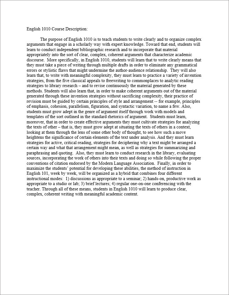
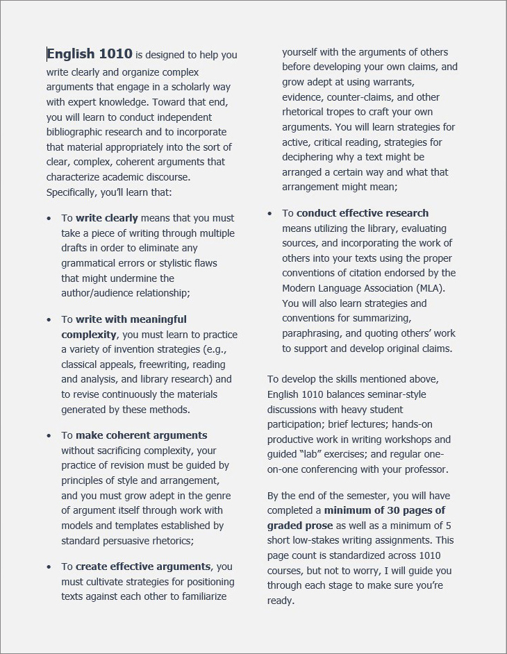
The original page displays a single dense paragraph in Times New Roman font with single spacing. The revised page breaks up the text into a list of bullet points and follows recommendations from the British Dyslexia Association:
- Use a 12-14 point sans serif font (e.g. Helvetica, Arial, Verdana, Tahoma). Serif fonts have tails on the characters and can blend text together.
- Divide the page into two columns so that each line contains between 6-9 words.
- Use 1.5 line spacing.
- Break up text into smaller paragraphs of between 2-4 sentences.
- Avoid black text on a white background, which can produce glare. Instead, use a dark font color on a light colored background, such as navy on light gray. (Note that this guideline differs from recommendations for readers with low vision, which often list high contrast like black on white. The goal is to design accessibly while still allowing users to adjust settings to their needs.)
- Opt for bold over italics to emphasize text—the jagged lines can wash out text.
- Align text to the left. Centering makes it difficult to find the next line, and justified text looks like one overwhelming block (“Text”).
These guidelines enhance readability, but they are not a rigid set of rules. The revised version, for example, uses 1.25 spacing instead of 1.5 to keep the course description to one page, another factor affecting readability. Writers must always consider the rhetorical context and content of a document.
Hierarchical Document Design
Students need a syllabus that is organized for quick information retrieval. Word processor features can dynamically improve document use. For instance:
- Table of Contents provides a snapshot of content for navigation.
- Headings differentiate sections and create hierarchy.
- Bulleting and numbering organize points into lists.
- Tables compactly show multiple dimensions of data.
- Text boxes group together related information.
- Bolded or underlined text emphasizes key points.
As you build in document features, use/create Styles within Microsoft Word. For example, label the title “Heading 1,” major sections “Heading 2,” and subsections “Heading 3”. These Styles function like tags that format text. For example, Heading 1 might be 18-point font and bold.
Often, when sighted people design documents, we just bold a heading manually because we can see a thicker font. But Styles not only bold text, they also tell screen readers which lines are headings. This enables document navigation for disabled users and creates a navigation pane for everyone.
Emphasizing Text
When using headings and special type, consider their cumulative effect as well as their individual effect. For example, overusing bold and underlining and red font might look like “the teacher yelling at the student,” as Mano Singham laments in “Death to the Syllabus.”
Moreover, consider the message brought to the forefront through emphasised text. The table below shows sentences from a disability statement.
| “Students must notify the instructor of accommodations within 2 weeks of class.” | “If you need accommodations, you have a right to have these met, so it’s best to notify instructors as soon as possible.” |
In the first example, bolding the time frame emphasizes deadlines in a way that can frame accommodations as an inconvenient burden. In the second, the emphasis is on the student’s legal right to accommodations, with the time frame presented as supportive guidance rather than a barrier. While timelines can be important for planning, they cannot override a student’s legal right to access. In each case, the tone emerges from the rhetorical interplay between design and content.
Concise Text
Long blocks of text can overwhelm readers, particularly those with dyslexia, ADHD, and other disabilities that affect reading and attention. With syllabi, the problem often comes from instructors trying to fit in too much. As one nursing student put it:
“In undergrad, I felt overwhelmed at the start of EVERY semester when I read the syllabus…thinking about all that work as one big chunk. Then, when I was done hyperventilating, I would remind myself to take one day at a time, one assignment at a time” (LeesieBug, 2008)
There are two strategies that can help prevent information overload: using hyperlinks in the syllabus and introducing information over the course of the semester, rather than including all of it in the syllabus (when appropriate).
These suggestions are based on research that reveals patterns in what students notice and what they ignore in syllabi. Multiple studies found that students pay the most attention to major due dates, test schedules, grading policies, and readings (Zucker, 1992; Smith & Razzouk, 1993; Becker & Calhoon, 1999; Marcis & Carr, 2003, 2004). Students were less likely to focus on sections like academic honesty statements, textbook details, prerequisites, or withdrawal dates. Obviously, some of these ignored items are still necessary in a syllabus, but some might be cut or hyperlinked.
Student interest shifts over the semester as well: early on, students look for big-picture deadlines, while later they focus more on daily schedules and assigned readings. But here’s the catch: as the semester goes on, students engage less with the syllabus overall. In particular, students don’t pay as much attention to items like makeup and late policies at the end of the term, right when they have many of these assignments due (Becker & Calhoon). This may be a critical moment for instructors to prompt students to revisit the syllabus and/or to reiterate key information in other accessible formats, such as in class, on the Learning Management System (LMS), or through digital announcements.
Interactive Text with Hyperlinks
Hyperlinks provide a happy medium in which the syllabus links, but does not repeat necessary information. Making the syllabus interactive in this way also allows students to access information they need in a particular moment on their own terms. One study even found that when students interact with syllabus hyperlinks (as opposed to reading a document without links), it significantly increased their sense of efficacy (Phillips, 2009).
Instructors can link to a wide range of materials, including:
- Paper prompts saved in a cloud storage service (such as GDrive, OneDrive, or Dropbox)
- Course websites or class management systems (such as Canvas, Blackboard, or Moodle)
- Library and bookstore websites
- University offices such as the advising center or the accessibility center
- Disciplinary style guides. The Purdue OWL offers strong guides for MLA, APA, and Chicago styles.
- University student codes of conduct. They cover a range of inappropriate behaviors, so the syllabus doesn’t have to outline all of them.
Hyperlinks can be used internally within a document, too. For instance, a table of contents can link to items later in the document. Oklahoma City University has a series of instructional technology videos for faculty, including “Adding Internal Document Links in Microsoft Word,” which guides users through a two-step process: 1) Insert a bookmark where you want the link to take your reader. 2) Insert a hyperlink within the table of contents that links to that marked location. These internal hyperlinks make documents more navigable on a digital device.
Digital Reader Resources
Certain reading tools can improve text accessibility for disabled people. Beeline Reader and Dyslexie have strong testimonial support and may be useful to some students. As with any supports, though, they are not universally preferred.
Beeline Reader: Beeline Reader is a browser add-on and PDF viewer that uses colors to match the end of one line to the beginning of the next, drawing the eye to the next line faster and easier. It can support readers with dyslexia, ADHD, and vision disabilities to read more quickly. Two internal studies with elementary school students suggest gains in fluency and comprehension.
Dyslexie Font: Dyslexie font alters letter openings, slants, and tails so that each character has a unique shape to aid letter recognition. Some studies report improved reading accuracy and user preference (de Leeuw; King, 2018), while others show no benefits (Kuster et al., 2017; Powell & Trice, 2020). A similar open-access, Opendyslexic, is also available. Because no font is overwhelmingly preferred by dyslexic readers, researchers are experimenting with AI-generated fonts to improve readability (Gilbert, et al.).
To make syllabus text more accessible, instructors can combine strong document design, intentional font style choices, and adaptive reading tools. The goal is to create flexible, multimodal content that enables students to control their reading experience.